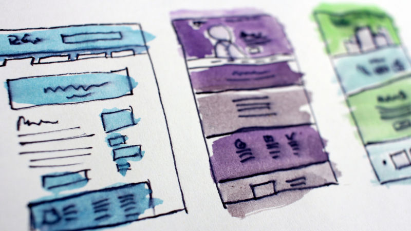
UX (User Experience) design is one of the most important elements of a site. Essentially, sites with good UX design are intuitive and usable while sites with bad a UX design are not. Employees who can navigate their site with ease are less stressed and can do their jobs more efficiently. For more information on the effects of UX design, check out The Importance of a Quality UX Design.
So how can you tell if your intranet has a decent UX? Test it. The only way to be absolutely sure is through UX testing. But if you don't have the resources for full UX testing, there are some common signs to watch out for.
1. Overly Complex Design
When it comes to an intranet, more isn't always better. On a well-designed site, only essential information is immediately visible. It's an easy mistake to make but "more" tends to read as just "crowded," rather than impressive and sleek. In some cases, there is so much happening on a single page that truly valuable information gets lost in the crowd. The home page just becomes a nuisance.
2. Over the Top
This also touches on the idea of "too much," but in a different context. While the previous point focused on content, this is more about functionality. Sites that try too hard hurt the average user experience. For example, if a user submits a form, there is no reason for the site to play a special animation each and every time.
Your intranet site should focus on doing only what it is intended to do. Any extraneous features, cute animations, or tacked-on modals only serve to distract and complicate your user's work day. The hundredth time they submit that form, they'll be a lot less excited about sitting through the animation. (For more information, see Clippy)
3. Allows Incorrect Behavior
Any well-designed product should be a guide, teaching user what to do and what not to do as they use it. But this doesn’t happen in sites with bad UX. File misnaming, uploading incorrect documents or document types, or other similar errors, are allowed by their intranet. If you have too many people misusing your intranet, you probably have an intranet with poor UX design.
4. Lack of System Feedback
An intranet should give users feedback when something happens on a site. If a user submits a form, they should know whether it was successfully submitted. If they have a process is running behind the scenes, they should be able to check on it.
Employees should never be left in a limbo of uncertainty about did an action take place or not. Because that uncertainty about the outcome of an action is a sure-fire way to make your intranet frustrating to use.
5. Largely Unused
Out of all 6 points, this one is the biggest warning sign. Intranets lacking widespread adoption tend to have major UX design issues. If employees in your organization don’t want to use their intranet, clearly something is wrong with it.
When something is too hard or frustrating to use, people just find ways to work around it. Intranets are an investment, of time, money, and effort – and disuse is a complete waste of that investment. So if your intranet isn’t getting the engagements that you thought it should, maybe it’s time to look at the UX again.
These are just some of the more commonly seen signs of the problem. In many cases, once UX design problems have been identified, they can be fixed. Just isolate the part of the site causing problems and make the necessary changes. Just make sure that the issue lies in site design and not in the underlying software or in the site's governance.
Ready for an intranet that has a guaranteed, top of the line UX?